Monday, January 23, 2012

Belgian Design in Tintin Easy Steps

Wow, I was taken back to my childhood this week when I saw the trailer for The Adventures of Tintin, Steven Spielberg's new movie.

Having grown up in rural, southern West Virginia, my primary access to the big world outside came through reading. I couldn't wait to receive my Children's Digest every month! Anyone else remember The Children's Digest? My father made sure that I received it, along with Highlights and Weekly Reader and all the other resources that little geeks like me [I] loved. Because of him, a voracious reader was born. But that's another story...


Isn't Tintin the cutest? The Children's Digest not only introduced me to The Adventures of Tintin, but also Rudyard Kipling, A. A. Milne, and other great authors and fun stories. 

In case you aren't familiar with it, The Adventures of Tintin [first published in French: Les Aventures de Tintin] is a series of comic books created by Belgian artist Georges Remi, who wrote under the pen name of Hergé. The series is one of the most popular European comics of the 20th century.

Tintin has long been admired for its clean, expressive drawings in Hergé's signature ligne claire style. [Watch him draw HERE.] Ligne claire [in English, “clear line”] describes comic art that gives equal weight and consideration to every line on the page. Because each line has the same thickness and importance and because the artist does not use hatching or shadowing, he creates a depth of field on the page that brings equal amounts of focus to the background and foreground. Many artists followed who adapted Hergé's style.

Hmmm...I think that Hergé's ligne claire style might be easily compared to the uber-trendy Belgian design that has taken the interior design world by storm.

I can't even say Belgian design without thinking of Axel Vervoordt, regarded as one of the best in our time. Vervoordt combines his profound knowledge of art history and applied arts with a high regard for architecture – plus an artist’s eye for balance, scale and proportion. His aesthetic is studied and followed by the most accomplished architects and interior designers in the world. It's easy to see why.


One of my favorite bloggers, Joni, of COTE DE TEXAS, wrote all about the super popular Belgian design trend way back when. And Belgian design hit the mainstream in the U.S. in a big way when Restoration Hardware added items from BoBo Intriguing Objects, founded by Mark Sage and Rudi Nijssen, of Belgium. I love everything from RH has produced lately – and the Belgian influence throughout their new stuff is unmistakable. Have you seen the massive catalog?


All this talk about great art and design has made me add Belgium to my travel wish list – once this darn recession is over! Can't decide between Antwerp and Brussels. Suggestions, anyone?


Anyway, let's hear it for gorgeous Belgian design! Since most of us don't have our degrees in art history and/or architecture like Mr. Vervoordt, I think I need a more simplified introduction to the style.

How about Ten [or is it Tintin?] Easy Steps to Belgian Design?

1. Exercise ruthless editing, sacrificing everything except items which perform a function. This is Vervoordt again.


2.  Make it about the mix – use smooth with rough, high and low, the posh with the earthy. Take a look at Ina Garten's bathtub.


3.  Favor solid fabrics over patterns. Decorator Kay Douglass did it well here.


[image from House Beautiful]


5. Use mainly light woods.


6.  Choose oversized accessories.


 7.  Keep the color palette simple and create an atmosphere of calm.


8.  Ask objects to blend, rather than fight. [Remember Hergé' and equal weight and consideration?]


9.  Speak a little Swedish and French: with the antiques and/or furniture, that is.


[image from Coté Sud]


10. Exercise careful and sensitive juxtaposition of art, objects and antiques, paying special attention to scale, form and balance.  [Okay, this is the hardest part to master. How does Mr. V do it?]


Well, this brings us full circle to The Adventures of Tintin. In the series, set during a fairly realistic 20th century, young Belgian reporter Tintin is aided in his adventures by his faithful dog, Snowy, a fox terrier.


In the old stories, the plots fearured elements of fantasy, politics, mystery and science fiction. The movie should be great – it's Spielberg, after all.

Tintin in Tibet was my very favorite. [I wasn't aware until recently that the Dalai Lama had praised Tintin in Tibet and given the author a Light of Truth award. That's so cool.]

If it's good enough for the Dalai Lama, I guess it's good enough for me. I might not get to Belgium right away, but I will definitely put on my Belgian pearls and go see the Tintin movie. And I can always make waffles.


Sunday, January 15, 2012

A Tribute to Imperfection: Wabi-sabi or Not

With my orange crush behind me, I'm moving on to more somewhat shallow topics about how we humans like to feather our nests.

My conclusion this week? You've gotta allow room for growth and change.

Always favoring a "collected" look in my home, I was never one who wanted everything matchy-matchy, or perfect, or straight off of a showroom floor. When just out of college and newly married, we bought our things slowly out of necessity – and most of our "collection" came from estate sales, yard sales, parents. I remember I had a friend who called her look early American poverty – and that term comes pretty close to the style our first apartment achieved.

But we were happy and we loved it.

It's been almost a quarter of a century and a couple of moves later. Our style is probably still early poverty, and our current home – 200+-years-old – has been one of our hobbies for more than a decade. I have continued to get more and more interested in decorating, architecture, and interior design as the years have passed.

I've been reading more and more lately about wabi-sabi, the Japanese aesthetic that nurtures all that is authentic by acknowledging three very simple realities: nothing lasts, nothing is finished, and nothing is perfect.

Sounds like my house!

Somehow, though, I think there must be much more to this Japanese term that embraces beauty that is imperfect, impermanent, and incomplete. However, I've heard the term thrown around so much lately that I'm going to pretend that I know what the Japanese mean when they call something wabi-sabi.

This, for example, could not possibly qualify as "wabi-sabi". I think this just qualifies as "messy".


Artfully-arranged clutter does not wabi-sabi make. At least I don't think so. How about this kitchen island?


As of late, I have been seeing weathered, organic objects and spaces reference wabi-sabi. I happen to like this reclaimed pine and marble piece from Williams-Sonoma [and I really want these light fixtures for my kitchen!], but I'm not sure that beaten-up wood and natural patina equals Japanese beauty.

Besides, they're making pasta here. If it were sushi, I might reconsider.
 

Recently in ElleDecor, talented New York decorator Sheila Bridges said she's seen enough of "earthy" stuff, and "just because something can be reclaimed doesn't mean it should be." So there!

Wabi-sabi seems to be more about imperfect, quiet beauty – always evolving. I'm beginning to think that those words might better describe the wabi-sabi attitude. Organic materials can certainly help create the mood, and the salvaging and re-purposing of materials can add to the aesthetic, but there's a little more going on here, I think.

This Pamela Shamshiri-designed kitchen was featured in the January House Beautiful issue. The article was called "The New Modern" and its author freely used the term – you guessed it...


...wabi-sabi. Oh, yeah. That's what's I'm talking about. Once you see it, you get it. Although I'm not really crazy about all the wood, this space is definitely peaceful and comfortable. Seems alive. This kitchen is constructed of weathered, re-purposed wood, which brings a certain rusticity to the space. Simple strips of wood take the place of hardware on the cabinets. Very cool.

Wow, what a cocoon this is. Now, if this isn't wabi-sabi, it darn well should be. Veranda magazine featured this room in its January-February issue. Check out that Asian-inspired lantern!


That's a gorgeous bedroom! But would one call it wabi-sabi? Decorated by Manhattan-based designer Brian McCarthy, it's definitely a mixture of periods and styles – but if loving you is wrong, I don't wanna be right. cluck! cluck! cluck!

Actually, I guess that bedroom might be a little too close to perfect, but it sure is serene. Does perfect, quiet beauty count? No, wait – imperfection is supposed to be the key.

Decorating genius Thomas O'Brien says he always strives for his spaces to feel lived in and settled; "As in dressing," he says, you want things to feel layered and less than perfect. " Does he mean wabi-sabi?


cluck! cluck! cluck!  O'Brien always reminds me that modern doesn't have to be harsh and hard. When he decorates, we always get comfy, clean, and cozy. And tranquil. Sanctuary!


Speaking of sanctuary, this space is certainly a graceful, light, calming one. Wabi-sabi or not, I'll take it. Love the Oly bed! This room is part of the Town & Country Designer Visions Showhouse for 2012. Read more about the showhouse designers HERE.

I definitely like the idea of imperfection in my home. Makes things somehow easier to achieve, doesn't it? Actually, all the imperfect stuff gets more and more appealing with every birthday and every new wrinkle. I just say, "Think wabi-sabi, wabi-sabi"....

But that's another story...


From Martha Stewart Living, this sparingly-decorated Steven Gambrel kitchen features floor stone that was reclaimed from a house in Tennessee. Each slab of stone has its own organic pattern, and Gambrel, who's an architect AND an interior designer, took the patterns into account when placing the slabs. Read more about this incredible guy HERE.

Even though I didn't know anything about wabi-sabi when I first started gathering things for our home in the '80s, I think I'm a bit of a natural at the style. Especially the imperfect, evolving parts – but merely by accident.

My husband complains that I'm always changing things in the house, but now I can cry wabi-sabi. Where did the chair go? Wabi-sabi! Why did you move that? Wabi-sabi!

Doesn't he know that all my little quirks and changes and imperfections make our home unique? When I leave stacks of paper on the dining room table I can totally embrace the imperfection and call it wabi-sabi – now that I've been educated.

Seriously, though, I'm going to try to pay special attention and embrace the wabi-sabi attitude from now on when it comes to our home. I plan to continue to choose things I love, with the hope that what I choose will age well and live with us and become a part of our collected, imperfect, evolving lives.

Sort of like this! [from House Beautiful again.]


Actually, the wabi-sabi premise has worked for us for the first 25 years of our journey. We've always left a little room for something unexpected to happen. When we travel, for example, we always leave a little in our budget for a "souvenir" for our house. And we always find the perfect place for it. That way, our home is always evolving.

As are our lives. Would it not be wonderful if we could just freeze time and things could be beautiful and last forever? We could keep our children little and we could stay youthful and our parents would never grow old and things would never change?

Remember: nothing lasts, nothing is finished, and nothing is perfect.

Too true.


Let's look at one more space. This room [by Isay Weinfeld] looks real and lived-in. The books make it look imperfect and in motion. A restrained palette and the openness to the outdoors [in Sån Paulo] add to the informal atmosphere. Love it.

For us and our home, a space is right when it feels right and nothing is too precious. When we're calm and relaxed in it. When it's unpretentious. When I can change it. Best of all, when our children [okay – young adults!] are in it – filling it with life.

How do you shape YOUR surroundings?

Nothing lasts, nothing is finished, and nothing is perfect.

Till next time – hope you see something worth clucking about.


Saturday, January 7, 2012

I Think, Therefore, I Cluck.

New year, new endeavors – thus, my first attempt at blogging. My daughter, who's 17, tells me it's addictive. I warned my hubby I was gonna try it.

Actually, starting a blog at this time in my life may be very healthy. Way cheaper than therapy, I dare say. My last child is getting ready to leave the nest in the spring, and with empty-nest syndrome fast-approaching, I've recently embarked upon a slew of new adventures to help keep me otherwise occupied...

cluck! cluck! cluck! My children [more like young adults] enjoy making fun of me because I have a habit of "clucking" when I'm super happy or I if I really like something, so the blog name is quite appropriate. There's even a little dance that goes along with it. Luckily for you, I can't show you here.

But this does beg the question: What is worthy of cluck-ery? The economy? Politics?

No, as a self-proclaimed design snob [and an opinionated one to boot], most of my posts will probably be related to the fine-feathered art of design. No promises that I won't include a few designed-challenged things occasionally – just for good measure.

Today,  I'm musing about my alma mater, West Virginia University – the Mountaineers – and our tremendous, record-setting win over Clemson this week in the Orange Bowl. Whoo hoo!

This brings me rather randomly to the color ORANGE.

Which I'm just loving in interior design at the moment.


My artist son has always liked orange – even as a two-year-old. I wasn't so sure for a long time, especially when it came to choosing colors for our home. But he was right – and okay – I was wrong.


A little punch of orange can change an entire room. Or define a brand. Just ask Hermes.

Look what orange does for this magazine cover.


And these accessories.


And, yes, orange can be warm and inviting and cozy when used in interiors. It doesn't have to be harsh and totally modern – think apricot.

Just look at what designer Frank Babb Randolph did with that mean old color. cluck! cluck! cluck!


I'm also loving these glazed apricot walls – these tones are definitely orange-toned. Libby Cameron decorated this Sister Parish-inspired room.


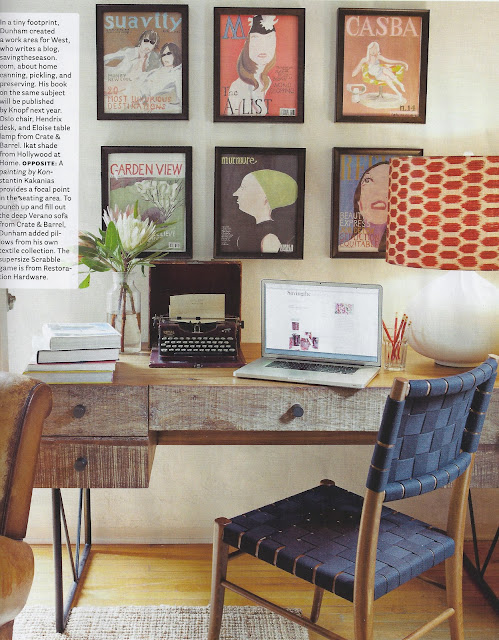
Peter Dunham has always used orange and he does so quite effectively in this California space. What a punch the orange adds. I have lampshade envy.


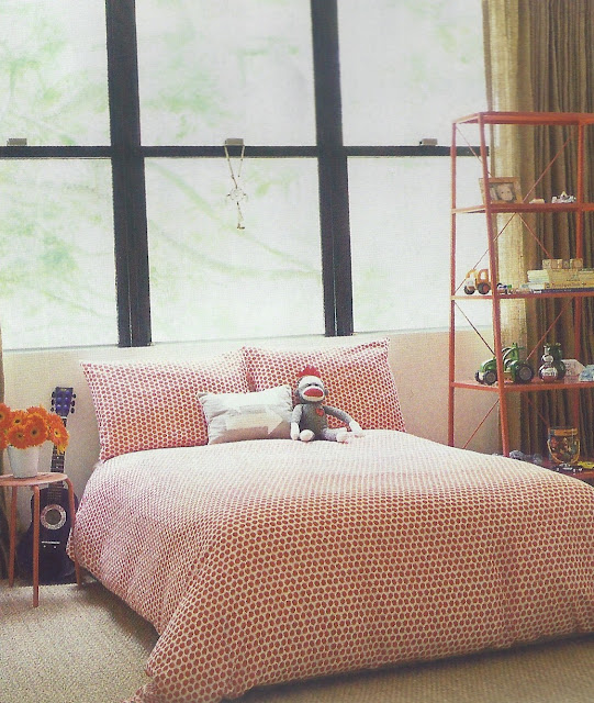
 We all know orange works well in a child's room.


And lately, I've started to embrace more of a mix of modern elements in my mostly traditional home, so I'm even starting to like rooms like this reddish-orangish one from Canadian House & Home.


JCrew, one of my favorite brands, has always been aware of the impact of the color orange – in all its vivid hues. In fact, I like JCrew so much that I recently became one of its seasonal employees, but that's another story.


And Katie Ridder, one of my favorite interior designers, uses orange often too. I find this sofa from her new book to be very cluck-worthy.


The color certainly adds cheer to the utilitarian mud room, no? Read more about using modern color in this month's issue of House Beautiful. To explore, see the video below.


Lately, I'm think that I'm going for the ORANGE – except, that is, when West Virginia is playing Clemson.
 

Let's Go,  Mountaineers!