
Actually, starting a blog at this time in my life may be very healthy. Way cheaper than therapy, I dare say. My last child is getting ready to leave the nest in the spring, and with empty-nest syndrome fast-approaching, I've recently embarked upon a slew of new adventures to help keep me otherwise occupied...
cluck! cluck! cluck! My children [more like young adults] enjoy making fun of me because I have a habit of "clucking" when I'm super happy or I if I really like something, so the blog name is quite appropriate. There's even a little dance that goes along with it. Luckily for you, I can't show you here.
But this does beg the question: What is worthy of cluck-ery? The economy? Politics?
No, as a self-proclaimed design snob [and an opinionated one to boot], most of my posts will probably be related to the fine-feathered art of design. No promises that I won't include a few designed-challenged things occasionally – just for good measure.
Today, I'm musing about my alma mater, West Virginia University – the Mountaineers – and our tremendous, record-setting win over Clemson this week in the Orange Bowl. Whoo hoo!
This brings me rather randomly to the color ORANGE.
Which I'm just loving in interior design at the moment.

My artist son has always liked orange – even as a two-year-old. I wasn't so sure for a long time, especially when it came to choosing colors for our home. But he was right – and okay – I was wrong.

A little punch of orange can change an entire room. Or define a brand. Just ask Hermes.
Look what orange does for this magazine cover.

And these accessories.

And, yes, orange can be warm and inviting and cozy when used in interiors. It doesn't have to be harsh and totally modern – think apricot.
Just look at what designer Frank Babb Randolph did with that mean old color. cluck! cluck! cluck!
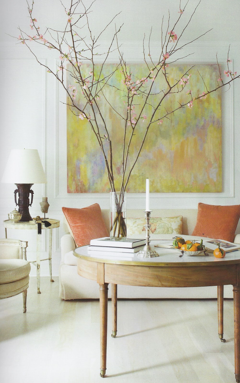
I'm also loving these glazed apricot walls – these tones are definitely orange-toned. Libby Cameron decorated this Sister Parish-inspired room.

Peter Dunham has always used orange and he does so quite effectively in this California space. What a punch the orange adds. I have lampshade envy.

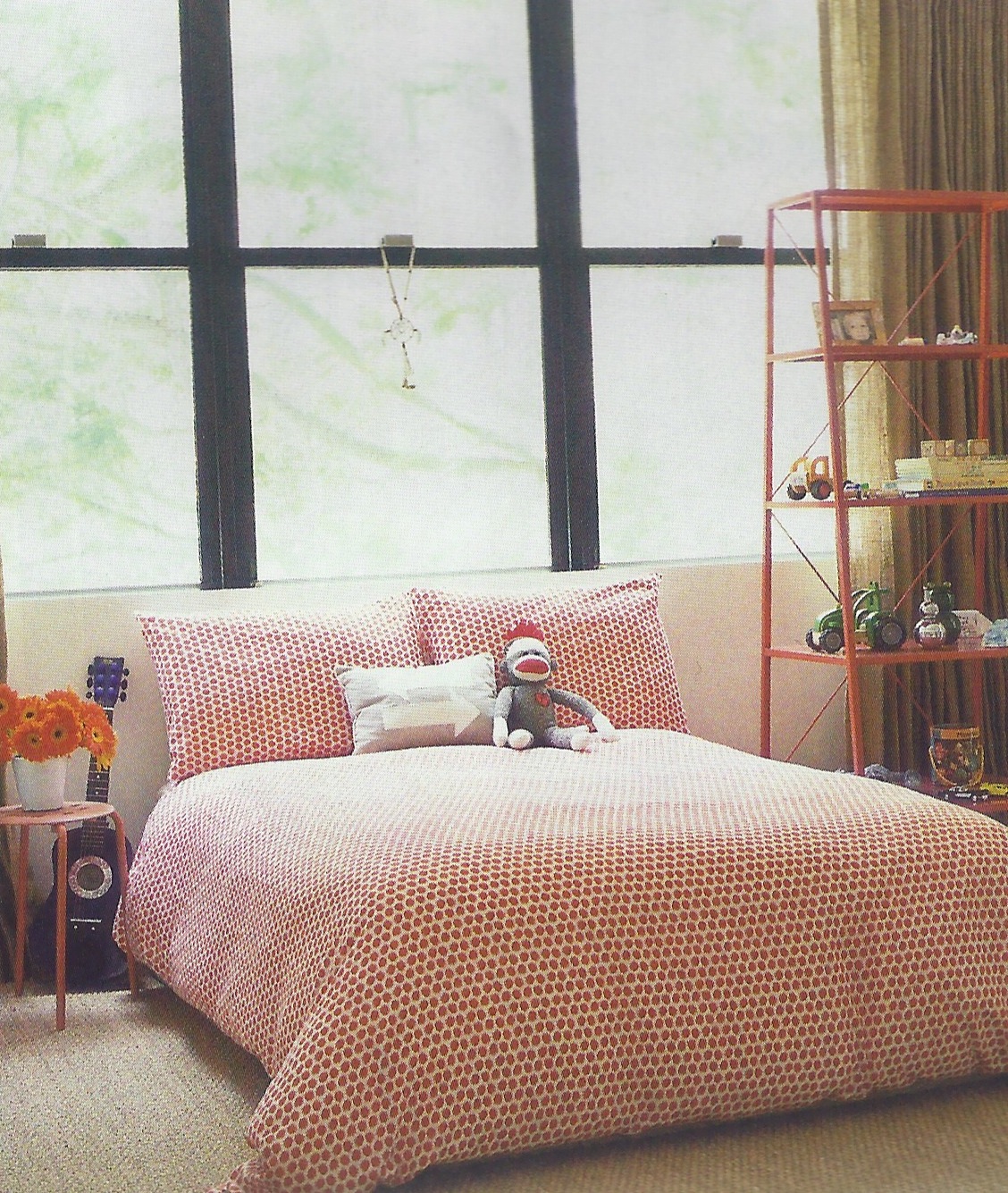
We all know orange works well in a child's room.
And lately, I've started to embrace more of a mix of modern elements in my mostly traditional home, so I'm even starting to like rooms like this reddish-orangish one from Canadian House & Home.

JCrew, one of my favorite brands, has always been aware of the impact of the color orange – in all its vivid hues. In fact, I like JCrew so much that I recently became one of its seasonal employees, but that's another story.

And Katie Ridder, one of my favorite interior designers, uses orange often too. I find this sofa from her new book to be very cluck-worthy.

The color certainly adds cheer to the utilitarian mud room, no? Read more about using modern color in this month's issue of House Beautiful. To explore, see the video below.

Lately, I'm think that I'm going for the ORANGE – except, that is, when West Virginia is playing Clemson.
 | |||||||||||||||
| Let's Go, Mountaineers! |
1 comment:
btgg229kif
golden goose outlet
golden goose outlet
golden goose outlet
golden goose outlet
golden goose outlet
golden goose outlet
golden goose outlet
golden goose outlet
golden goose outlet
golden goose outlet
Post a Comment